
Let’s face it: the default <apex:pageMessages> styling is not that pretty/easy to bring into line with a Client’s style, particularly when being used in a Portal (I haven’t personally worked on any clients using Communities yet, so can’t comment on the aesthetics there!).
This framework gives you a way to exert control over style when providing confirm/info/error/warn messages to your users in Visualforce pages. It’s pretty simple and self-contained, including 100% test coverage for each class. The only things you need to bring to the party are Bootstrap css and js, and some very minor alterations to your controller and page files, which can be easily done with a quick find/replace or two.
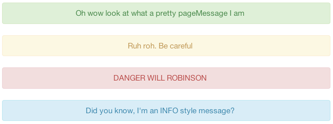
Here’s an example of what it looks like, using Bootstrap styling (with the dismissable option turned off):
I’d recommend downloading the gist and trying it out in a dev org against any old page, as you read the rest of the article.
Click here to download the Gist discussed in this article
Prefer to Skip Ahead?
Dependencies
Bootstrap css file : Optional, but strongly recommended unless you need to
                     roll your own style
Bootstrap js file  : Optional, but required if you want your messages to be
                     dismissable
Installation
Drop each of the following files into your org. No modifications are necessary. If you download the entire Gist as a zip/tarball using the button above, you may save a tiny bit of time ;)
Controller_PageMessages.cls
Test_PageMessages.cls
pageMessages.cls
pageMessages.component
Usage
In your Apex code
Anywhere you would ordinarily do:
ApexPages.addMessage(
        new ApexPages.Message(
                ApexPages.Severity.SeverityLevel,
                'Message'
            )
    );
You now do the following (really easy to do a find/replace):
PageMessages.addMessage(
        new PageMessages.PageMessage(
                PageMessages.Severity.SeverityLevel,
                'Message'
            )
    );
In your Visualforce pages
If you’re not rolling your own style completely from scratch, import bootstrap:
<link href="//netdna.bootstrapcdn.com/twitter-bootstrap/2.3.2/css/bootstrap-combined.min.css" rel="stylesheet">
<script src="//netdna.bootstrapcdn.com/twitter-bootstrap/2.3.2/js/bootstrap.min.js"></script>
Anywhere you would ordinarily do:
<apex:pageMessages/>You now do the following (again, really easy to find/replace!):
<c:pageMessages/>If you want users to be able to dismiss the messages, then do the following:
<c:pageMessages closableErrors="true"/>If you’re using Bootstrap, congratulations, everything looks wonderful.
Minor Gotchas
Messages added in a Controller Constructor
Messages added in a Controller Constructor won’t “just work” as such (but there’s an easy solution!). The easiest way to explain this (and the solution) is going to be with an example. Suppose your Controller Class creates a message inside the constructor, as follows:
public with sharing class Controller_TestMessages {

    public Controller_TestMessages() {
        PageMessages.addMessage(
                new PageMessages.PageMessage(
                        PageMessages.Severity.CONFIRM,
                        'Beep Boop'
                    )
            );
    }

}
Now you would expect the message “Beep Boop” to appear on your page yes? No. It doesn’t. The solution is easy. Just make a method like the following in your Controller class (name it what you like):
public void loadMessages() {
    //Shim to get PageMessages that were added in the Constructor into the page
}
And add this method as the action in the <apex:page> tag in your page, for example:
    <apex:page controller="Controller_TestMessages"
        showHeader="false" sidebar="false" standardStylesheets="false"
        action="{!loadMessages}">
Dismiss/Close buttons
If you don’t use Bootstrap javascript (or js is disabled!), the dismiss/close buttons will not work. Note that the default position for this is that messages are not closable unless you explicitly add that to the pageMessages component tag on your page (see Usage section above).
Styling things yourself
If you don’t use Bootstrap, it’s gonna be really ugly as there’s no inline style. However, the structure is very simple, so in most cases you only need to add css to deal with the div with class “alert”, and then specific styling details for the “alert-warn/info/alert/error” classes. The structure of the html produced by the pageMessages component is as follows, repeated for as many messages as you added in your apex:
<div class="alert alert-[info|warn|alert|error]">
[<button class="close" data-dismiss="alert" type="button">×</button>]
[Message]
</div>Where:
[<button>...</button>]        : only appears when closableErrors is set to true;
[Message]                     : is (obviously?) the message you provided in
                                your apex
alert-[info|warn|alert|error] : output depends on the severity level you
                                indicated in your apex